Corporate Identity & Brand Storytelling
Reintroducing 25 Years of Goodwill & Envisioning 25 Years More.
Let us reintroduce a local pioneer in public communications, leaping from success to success for over two decades. We took tremendous care with APRW’s (formerly Asia PR Werkz) silver jubilee brand relaunch—to capture the experience of 25 years, imbued with youthful vigour to take the firm beyond another 25 more.
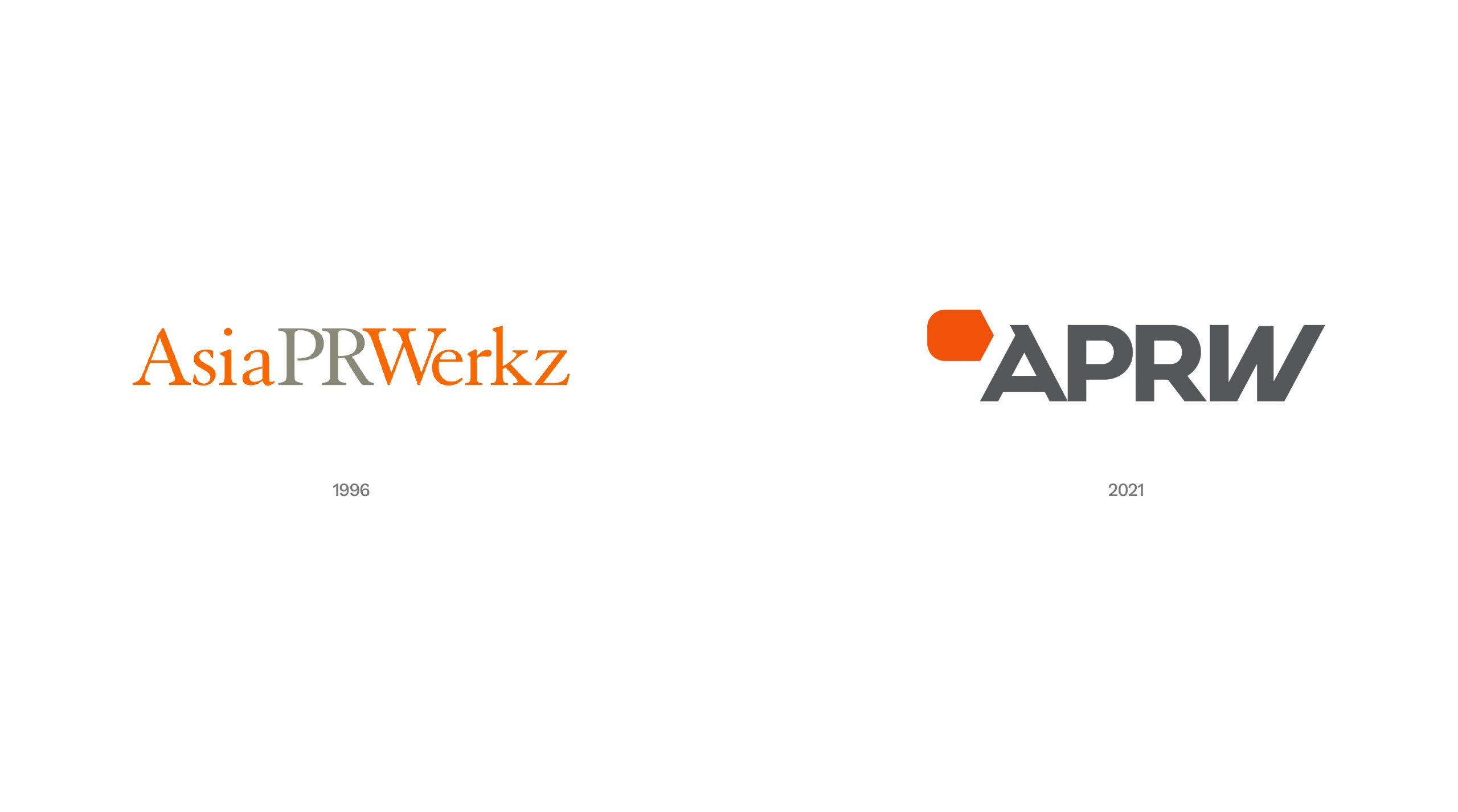
Becoming APRW from Asia PR Werkz: What began as a union of two public relations firms in the mid 1990s grew into an integrated communications agency at the forefront of the social wave.
“We came together to take stock and reflect on our identity and accelerate towards becoming the agency of choice.”
– Ginny-Ann Oh
Director, APRW

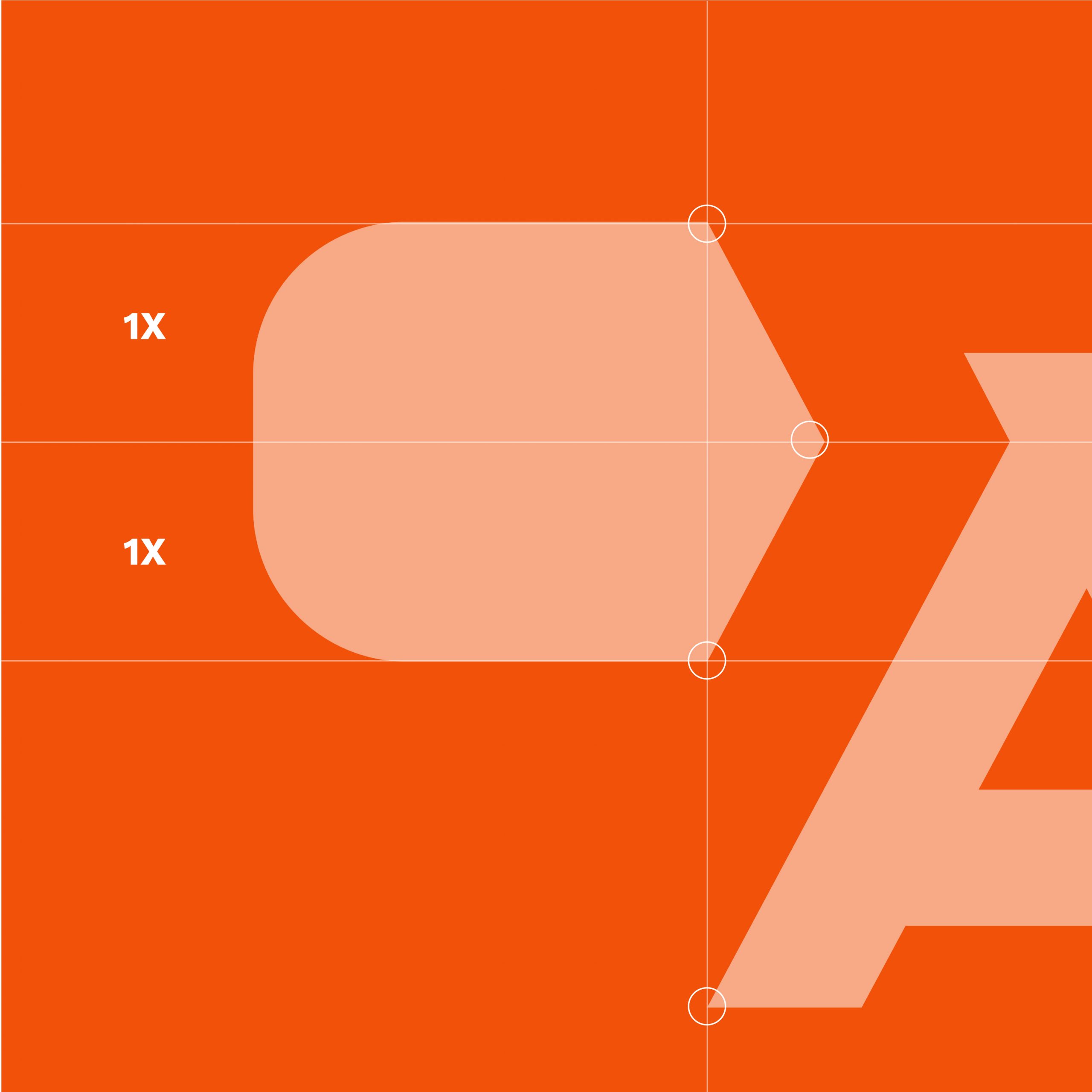
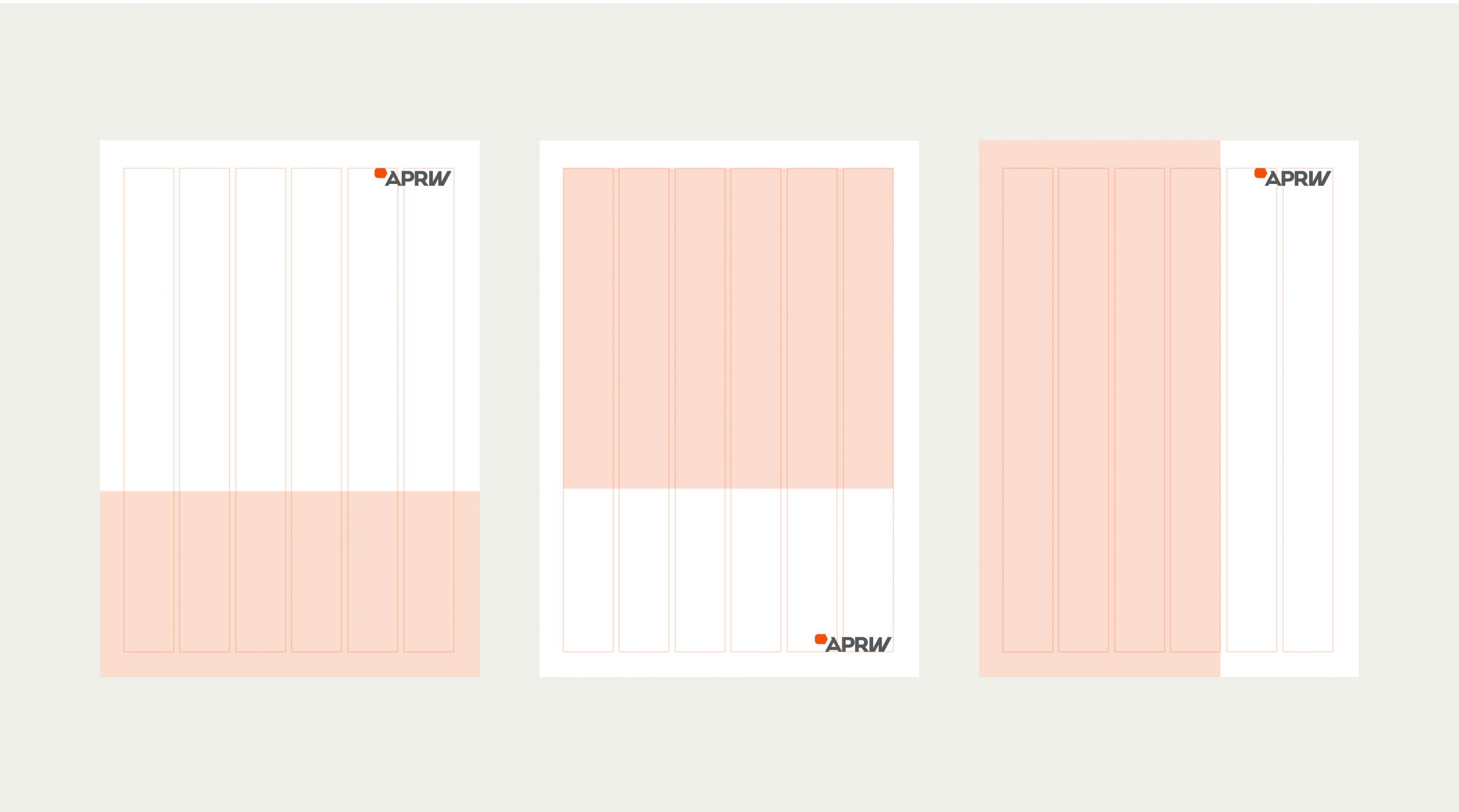
Constructing the Reimagined APRW Logo





Customised Brand Iconography

Corporate Communications
An eye depicting the strategic points of view and the multitude of eyeball attention that APRW helps command for a corporation.

Digital Communications
The two opposing arrows represent 2-way communication in the social space. They come together to form a lightning ‘boost’ symbol, representing APRW’s value-add to online communications at lightning speed.

Marketing Communications
Three circles symbolise the omni-channel marketing communications approach, arranged in a triangle to symbolise interdependence and multiple angles of communications.

Media Relations
Concentric rings invite interpretation: it is a target for focussed communications, resonating broadcast rings symbolising wide media reach, or various spheres of influence that the power of media brings.

Public Affairs
An alignment of people, government, and media, presenting a common, unified and clear front in communications that impact and shape society.

Crisis Communications
The grey brick never falls flat, supported by strong crisis communications hued in APRW’s palette, preventing any major fall come what may.
With its new identity, we are proud to help APRW take
the next leap forward for the next 25 years and beyond.
