Industry
Wellness
Company Size
10
Years Prior
12
Project Year
2023


Healthcare Brand Strategy: Demystifying a Unique Approach
Defining the Brand’s Visual Core
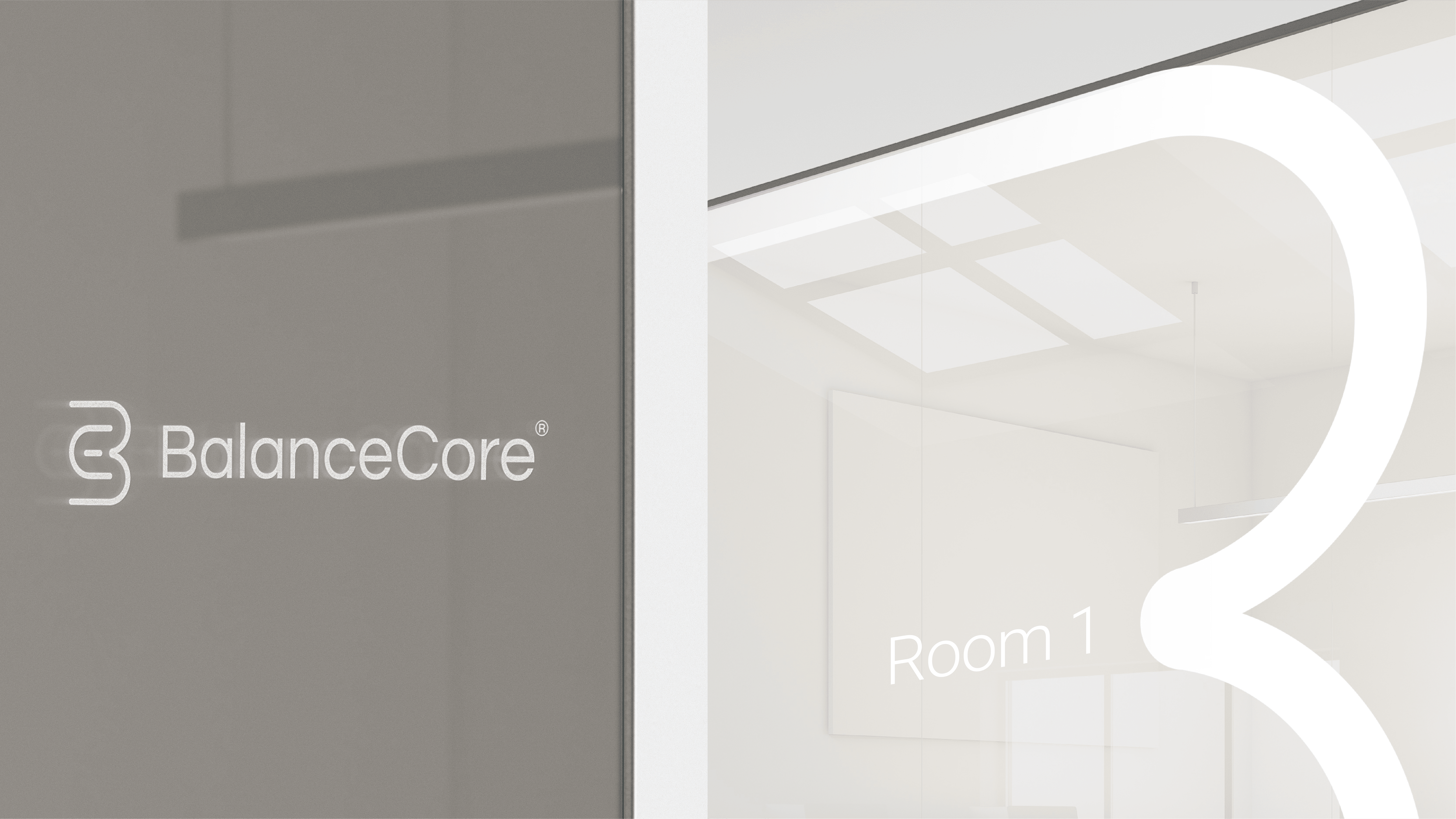
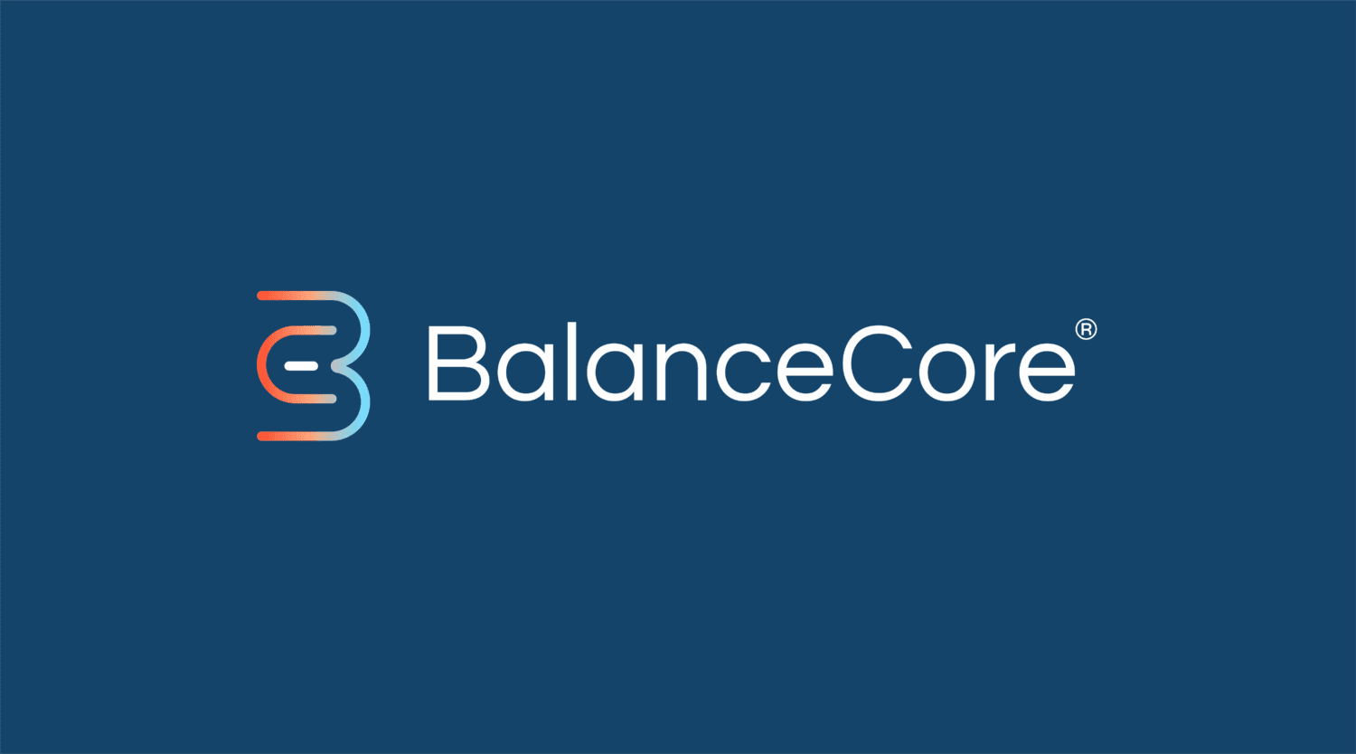
The BalanceCore logo needed to instantly communicate the nature of its industry, symbolise the company’s unique approach, appeal to its higher-end demographic, and achieve visual distinctiveness. We adopted a distilled expression of the human form in smooth motion, inspired by the natural arcs and postures of the body in states of alignment and flexibility. Highlighted at the centre of the letters “B” and “C” lies the distinct visual core, depicted in a single colour to symbolise BalanceCore’s Philosophy to solving the root causes of pain.


Wellness Visual Identity & Brand Architecture
BalanceCore — Unifying the Brand and Philosophy Through Name
What started being known as an “Integrative Balance Approach” was strategically renamed the BalanceCore Approach. The new name serves two harmonious goals: Giving a proprietary technique a distinctive and unique name that sets it apart from convention, and further raise brand awareness of the BalanceCore name through use and association. The result is a less confusing way to explain their value proposition, and constant reinforcement and association with the BalanceCore brand.


Visual Expression
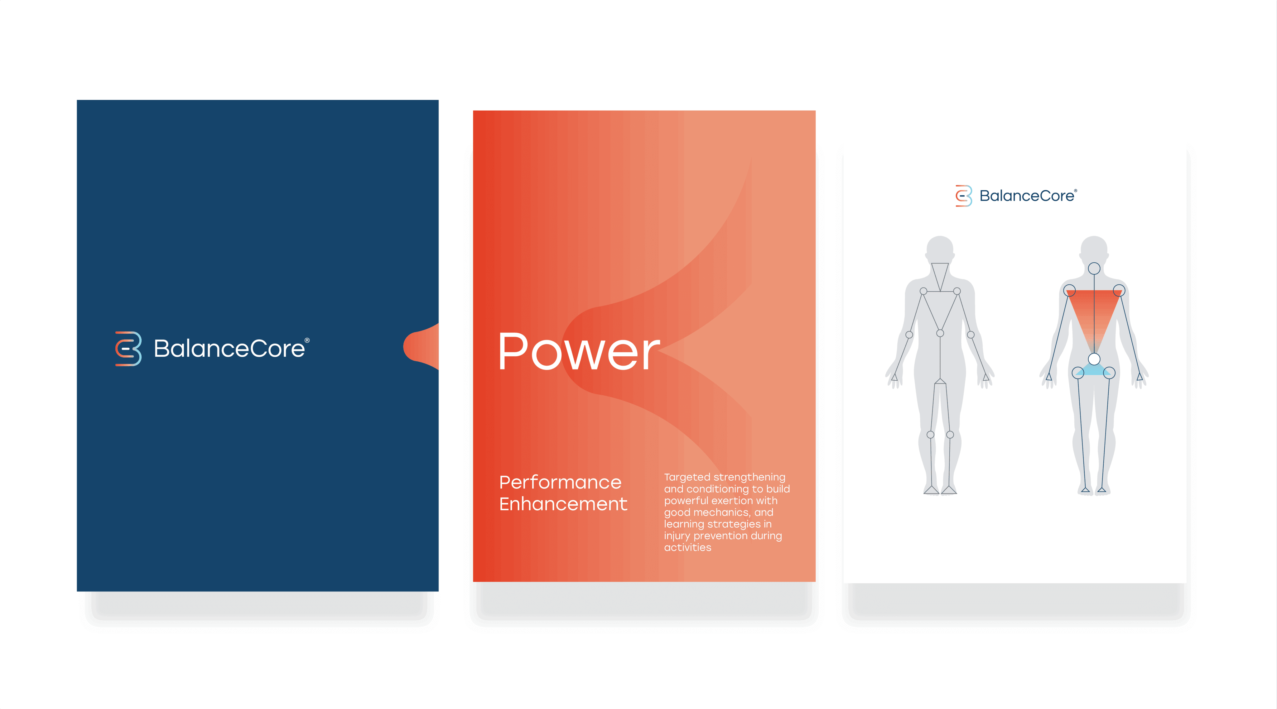
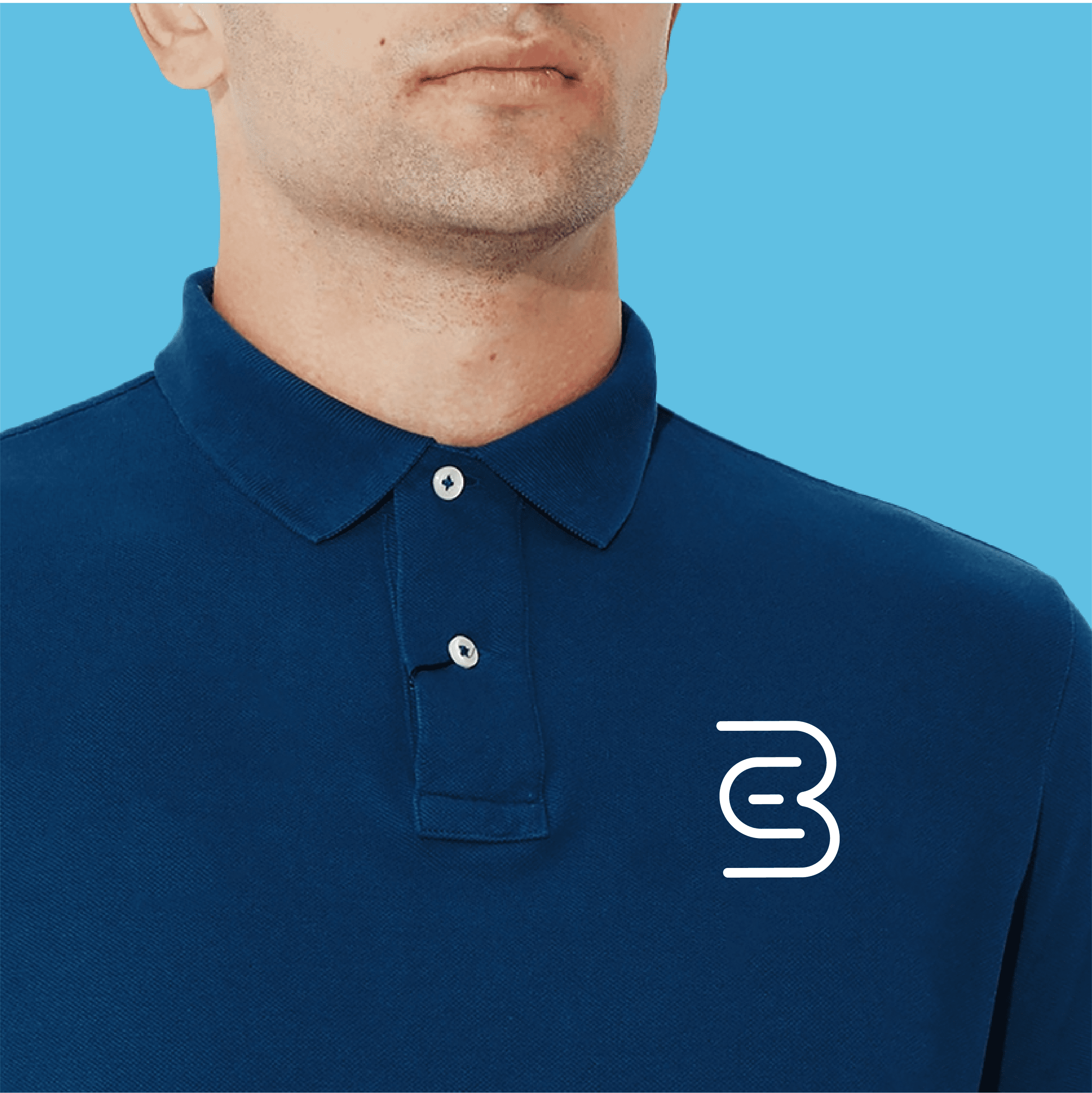
BalanceCore’s identity is shaped by the concept of flexibility — a central tenet of its therapeutic approach. The use of smooth, curved lines and the distinct lack of ‘body’ evokes feelings of calm, agility, and peace: The results of any client of BalanceCore expects.
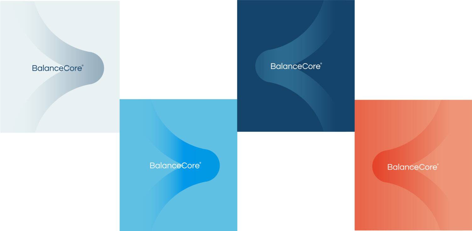
A gradient palette of cool and warm tones references the harmonious integration of Eastern and Western medicine, embodying both calm precision and dynamic energy.
Typography is clean yet supple, supporting the brand’s professional tone while remaining approachable and human.