Industry
Renewable Energy
Company Size
800
Years Prior
>18
Project Year
2025
Elevating B2B ESG Corporate Branding
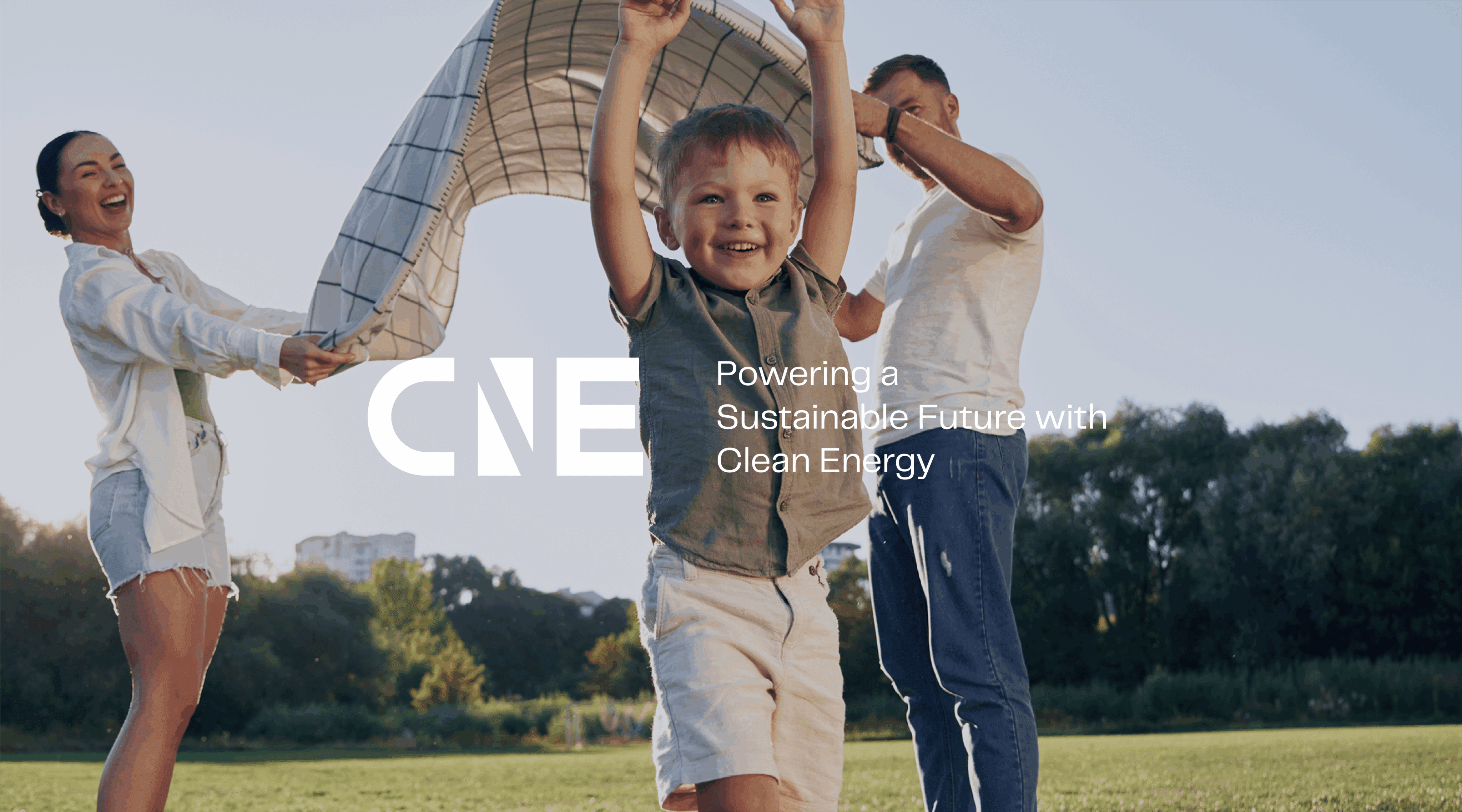
Owned Videos That Show. Don’t Tell.
Owned videos deliver tremendous credibility and proof of a business’ presence. Our teams worked to use them effectively in furtherance of the brand’s internationalisation strategy. Scouring over hours and hours of footage, we carefully selected scenes that showed an element of their business—the sheer scale of their operations, cutting edge technology, and sheer attention to detail.
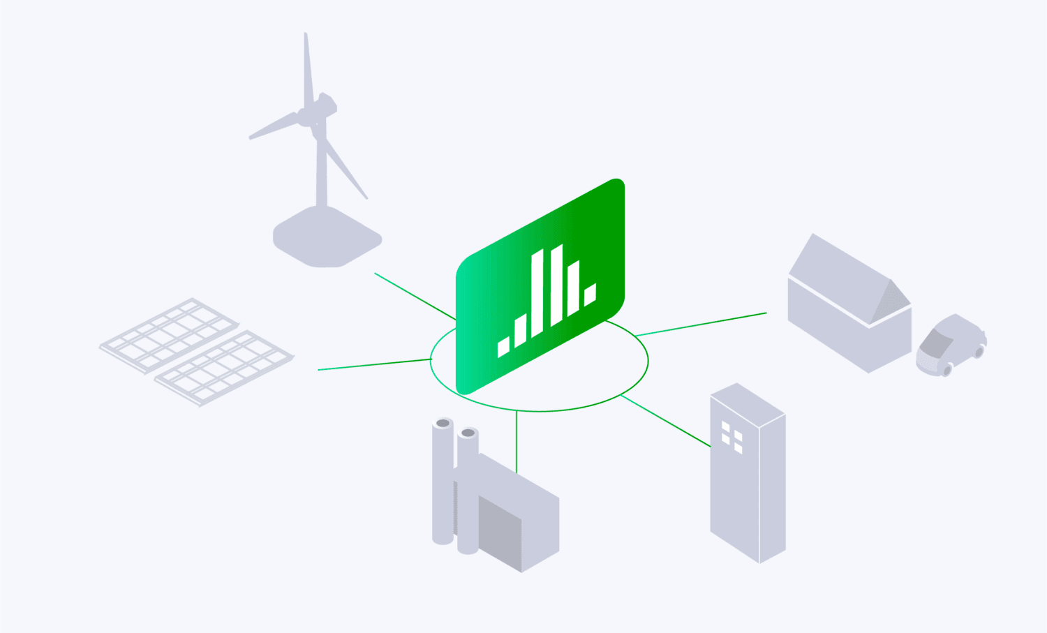
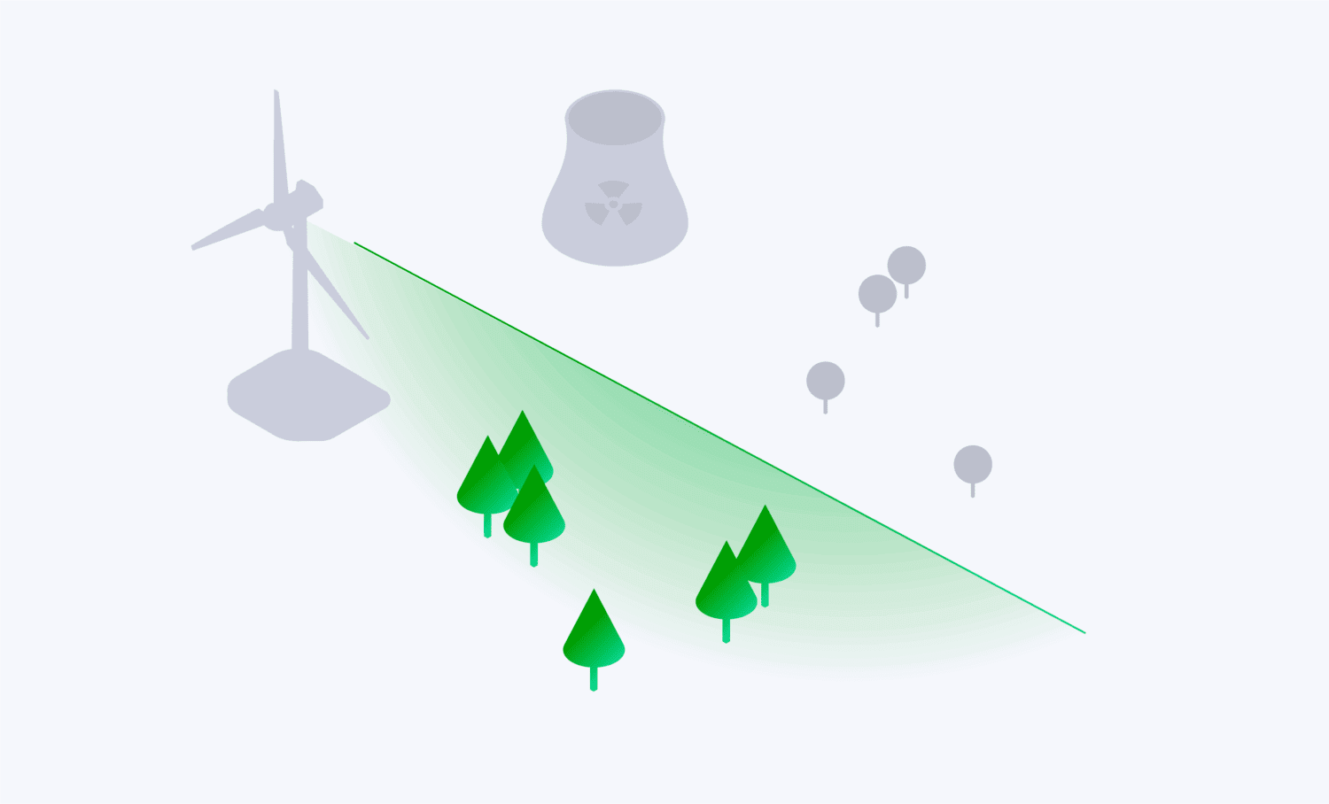
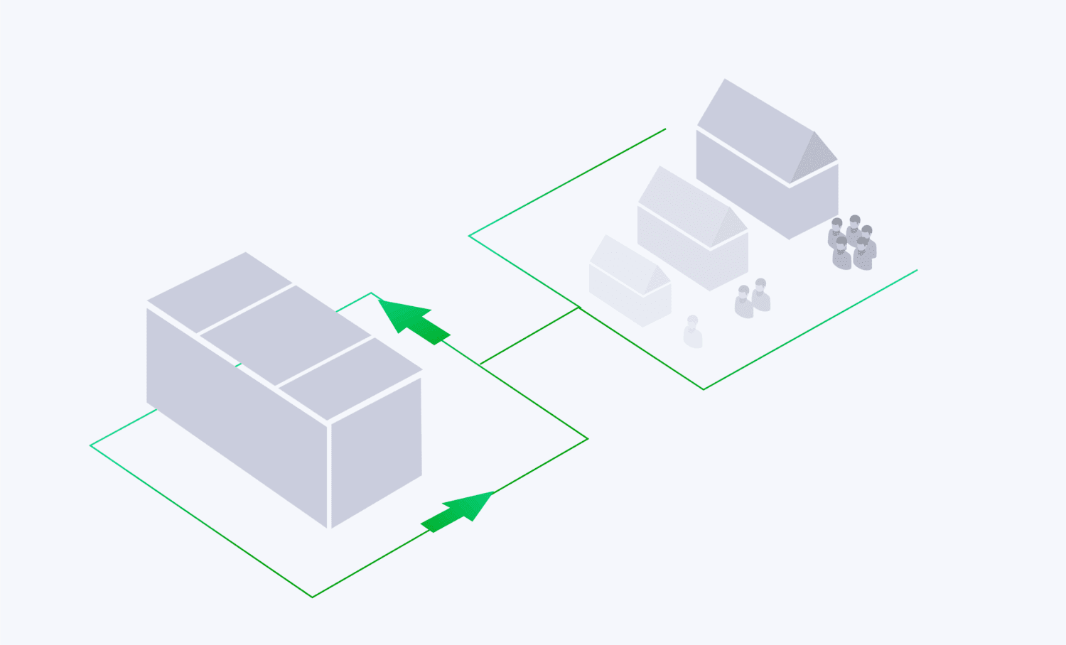
Custom Graphics—It’s All in the Details
Discarding stock libraries and pre-made iconography, our team designed customised graphics that would become the IP assets of the company and brand. Aesthetics alone wasn’t the point: It was to demonstrate the company’s commitment to detail, through every message and interaction online.
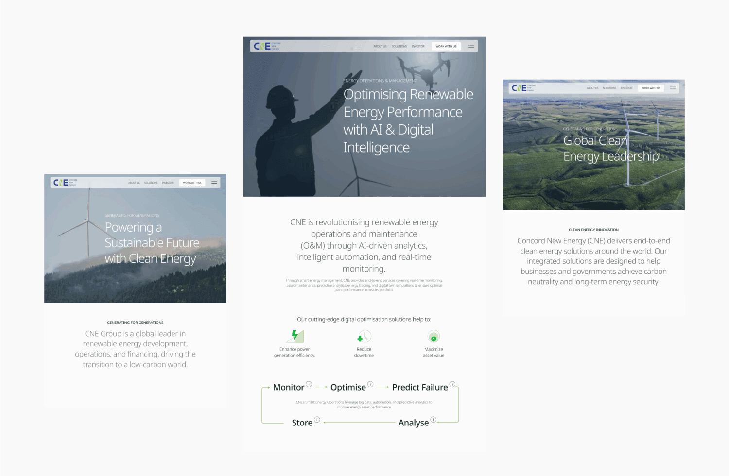
Renewable Energy Website Design & Architecture
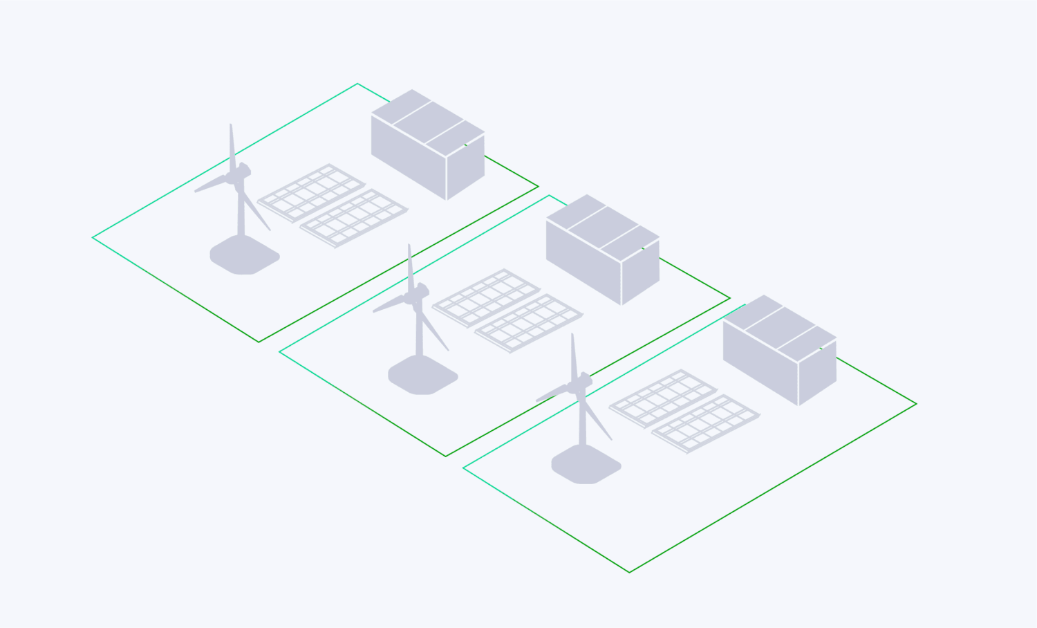
Bespoke Iconography for Renewable Energy Website Design
We customised a series of icons to unify the website’s visual language to communicate the brand as they communicated function and content. More than enhancing the experience of users interacting with the site, it allowed them to also interact with the brand and their purpose. Clean. Energetic. And a near-neurotic attention to detail.
Design Applications with Shared Brand DNA
Creating brand unity meant dissecting the distinctive elements of the CNE logo, and using them in expanded and subtle ways. We designed elements throughout the website that echo its shape and geometry. This integration and recall to features of the logo helps builds brand recognition and distinctiveness, increasing the value of their visual identity IP. Most crucially, these design choices silently communicated the company’s internationalisation strategy everywhere.
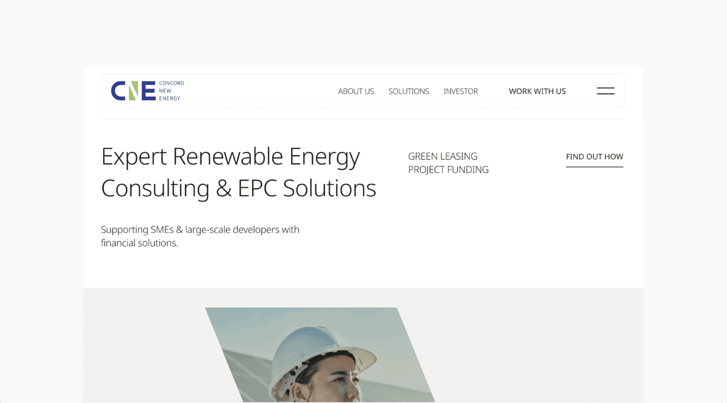
Sharper Words for a Global Clean Energy Brand Strategy
In the complex field of cutting-edge clean energy solutions, CNE needed to ensure that their innovations and efforts did not get lost in words, poor layouts, and navigation. We worked to keep titles informative and simple, without losing content nor context. Juxtaposed with relevant imagery, we ensured clarity in words and certainty in navigation, elevating the experience of the site worthy of an international audience and clientele.