Eye-catching graphics and images tend to take the center stage when it comes to branding and design. Typeface, on the other hand, is often overlooked yet it can be just as impactful with the right application.

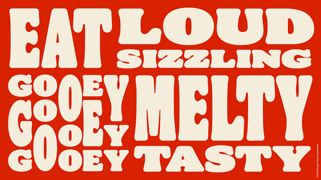
Burger King’s new identity, in which typography dominated the visuals and is used to convey and evoke certain emotions, is a great example that typeface too holds the power to increase sales and drive brand association.

No Graphics Needed
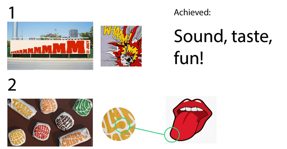
Our subconscious mind associates certain shapes with certain feelings. For example, the “mmmMMM” text mimics comic dialogues to convey a sense of action and excitement, while the gradually increased sizing creates anticipation. The layout of the text together with the play on sizing alone is strong enough to tell a story without the need for images or sentences.

Typography is Design Itself
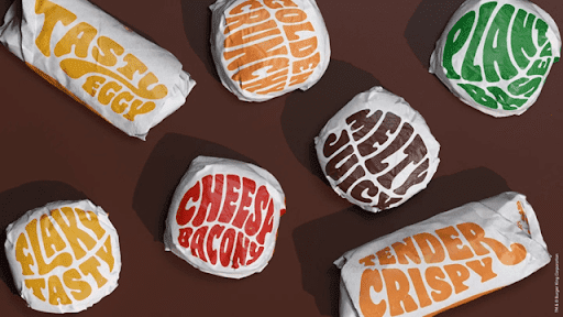
On the wrapper itself, the rounded, organic curves of each letter correspond to the curves of both our tongues and luscious droplets, painting in our minds a picture of a juicy, juicy burger just waiting for you to bite into it.
The colours used cleverly adds on to the imagery: the brown of freshly grilled beef patties and BBQ sauce, the yellow of golden fries and fluffy scrambled eggs, the orange of crispy chicken patties and airy buns, the green of crunchy lettuce and the red of chilli and ketchup.
Can you already feel the satisfaction?

All in all, the right typeface can evoke desired emotions that contribute to the overall experience for the target audience. Burger King’s rebrand is one that is as delectable as it is wholesome, and shows just how powerful typography can be.


